
Black and White Art Goes With Everything. Including Your Personality.
Colourful, quiet, cluttered, carefully curated or somewhere in between. Your walls don’t need permission to be yours.
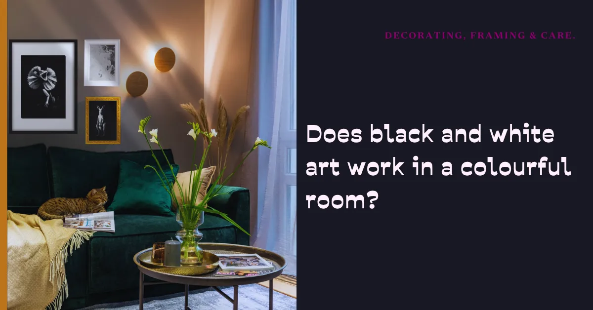
Does black and white art work in a colourful room?
Yes.
There. That was a very short article, wasn’t it?
Of course, there’s a little more to say. But I think the question is interesting because it suggests there might be a decorating rule we’re supposed to follow. As though a room can have too much personality, or a painting needs to pass some sort of colour-coordination test before it’s allowed through the front door.
I’ve never been particularly interested in that idea.
I paint in black, white and grey. And one of the things I love about monochrome art is how easily it can live with other colours, other styles and other people’s personalities.
The room doesn’t have to change to accommodate the painting. And the painting doesn’t have to dictate how you live.
Maximalist? Wonderful. Minimalist? Also wonderful.
Some people love rooms full of colour. Rich walls, patterned cushions, collected objects, books, plants, interesting furniture and things they’ve picked up over the years. Every corner has something to look at.
Other people feel happiest in a room with clean lines, open space and only a few things on display.
Neither approach is more correct.
And there’s a whole world between the two. Most homes aren’t carefully labelled decorating styles anyway. They’re mixtures of what people love, what they’ve inherited, what they can afford and what has somehow survived three house moves.
A black and white painting can belong in any of those rooms.
In a colourful space, it might provide a moment of contrast among all the patterns and colours. In a quieter room, it might become one of the strongest visual features. Surrounded by collected treasures, it can join the conversation. On a nearly empty wall, it gets to speak for itself.
It’s still the same painting. The room gives it a different setting.
Colour doesn’t frighten black and white
I sometimes think people imagine monochrome art needs a matching monochrome room. White walls, black furniture, perhaps a carefully placed grey cushion.
That can look beautiful, if that’s what you enjoy.
But it isn’t a requirement.
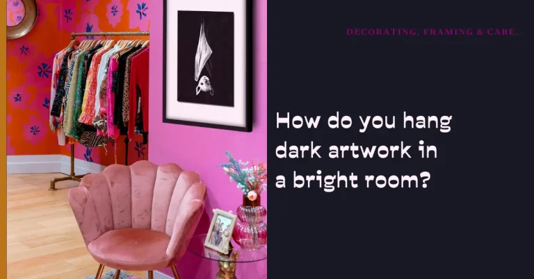
Put a black and white painting against a deep green wall and the whole mood can shift. Place it in a room full of warm oranges and pinks and it becomes part of something lively. Hang it among bright cushions and patterned textiles and it doesn’t suddenly forget how to be art.
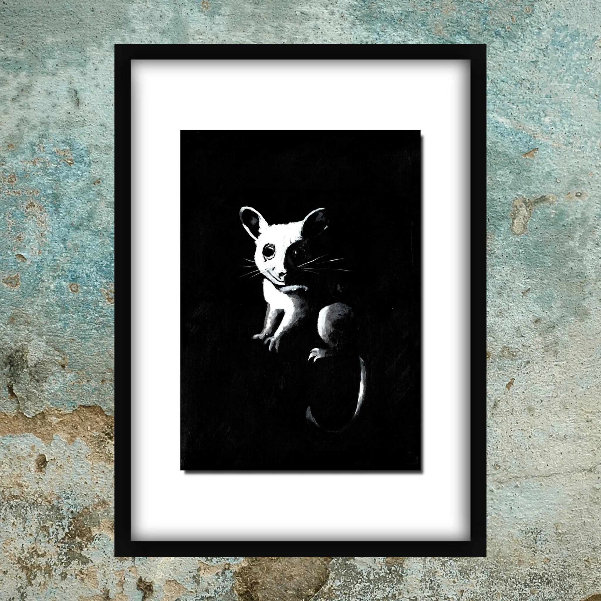
Black and white doesn’t have to compete with every colour in the room. It has its own kind of presence.
Sometimes the absence of colour is exactly what makes a piece interesting in a colourful space. Your eye notices the change. It’s a different rhythm among all the other things happening.
And sometimes it simply settles in beautifully, without demanding to be the star of the show.
Both are good outcomes.
The same painting, a completely different feeling
This is one reason I enjoy seeing artwork shown in room mock-ups.
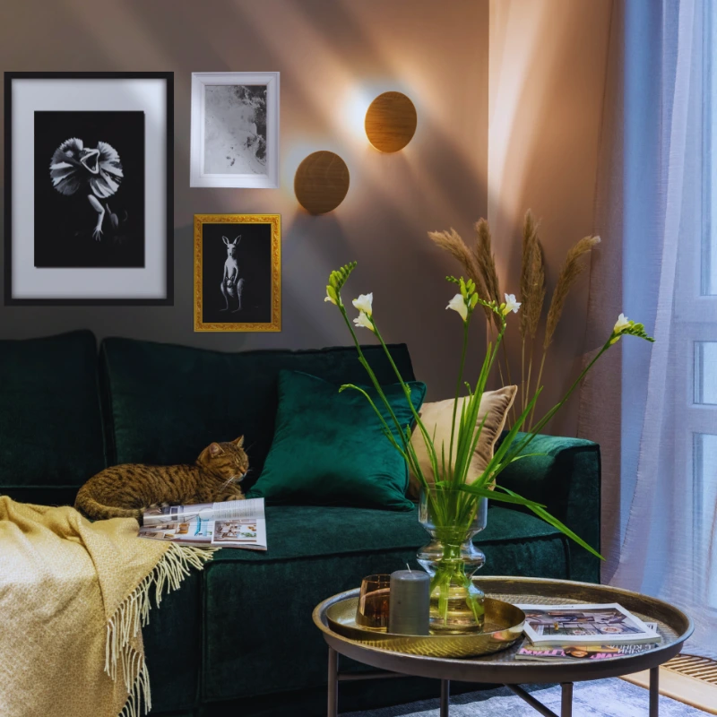
A photograph of a painting on its own tells you about the painting. A mock-up gives you another kind of information: what might happen when it meets a room.
Imagine the same dark, expressive painting in three spaces.
First, a bright living room with a colourful sofa, patterned rug and a collection of objects on the shelves. The painting might add a strong black-and-white shape that gives your eye somewhere to land.
Now put it in a calm bedroom with pale walls, soft fabrics and very little decoration. Suddenly, that same painting might feel more mysterious or contemplative.
Then picture it in an eccentric hallway with a bold wall colour and a whole collection of pictures. Here it becomes one character among many, perhaps the slightly odd one you notice on the way past.
None of those rooms is the correct room.
And the mock-up isn’t a promise that the painting will look exactly the same in your home. Screen colours, lighting, scale and the surrounding furniture all change the impression. It’s a way to explore possibilities, not a set of instructions.
I like that because art shouldn’t have to live in a perfectly styled showroom to make sense.
You don’t have to match the cushions
There’s a lot of decorating advice about pulling colours from a painting and repeating them around the room.
That can be a fun approach when you’re using colourful art. But what happens when your painting is black and white? Do you rush out and buy a collection of black cushions?
Please don’t feel obliged.
If you happen to love a black-and-white scheme, enjoy it. But if your favourite sofa is mustard yellow, your curtains are patterned and there’s a bright red chair you refuse to part with, the painting can still come along.
A room doesn’t need to look as though every object was purchased in the same afternoon.
In fact, some of the most interesting spaces have a bit of disagreement in them. Something old next to something new. A serious piece beside a playful one. A painting that feels a little strange above a very ordinary piece of furniture.
Those contrasts can make a room feel personal rather than assembled.
I don’t think a painting needs to match your possessions as much as it needs to mean something to you.
A little practical thinking, without the rules
There are still a few useful things to consider when you’re deciding where to hang a painting. Not rules. Just ways to see what you like.
Try looking at the artwork from the place where you’ll actually spend time. A painting above a sofa looks different when you’re standing in front of it than when you’re sitting across the room.
Think about the size in relation to the wall and furniture. A small painting on a huge empty wall can look wonderfully deliberate, or it can feel a little lost. A larger work can command attention, but it doesn’t have to fill every available centimetre.
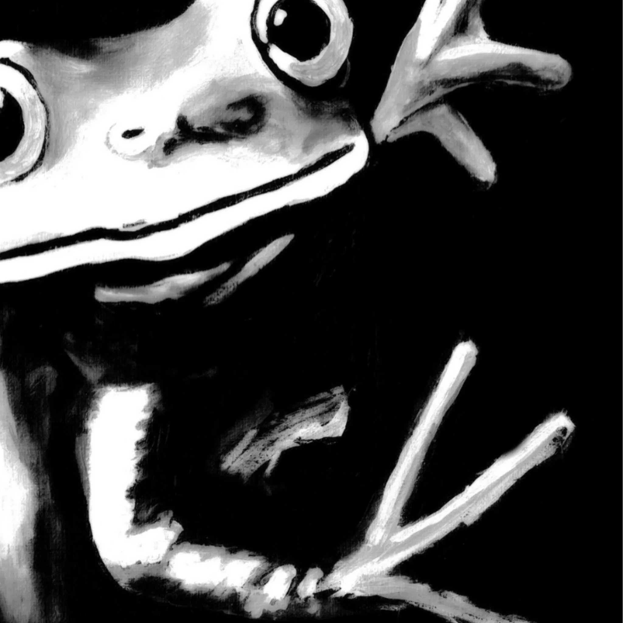
And pay attention to light. My paintings use a lot of black, and subtle grey marks or differences in the surface can become easier or harder to see depending on the lighting. You want enough light to enjoy the artwork without harsh reflections or direct sun beating down on it.
If you’re unsure, try a simple paper template in the approximate size of the artwork and tape it to the wall. Live with it for a day. Walk past it. Sit down. See whether the placement feels right.
That’s much more useful than someone on the internet declaring that every picture must hang at one magical height.
And if you change your mind later? Move it.
The room belongs to you, not the painting
I think the best homes tell you something about the people living in them.
They don’t all need to look the same. One person wants a room that feels restful. Another wants colour everywhere. Someone else loves a mixture of vintage furniture, contemporary art and objects that make absolutely no sense together until you realise they’re all things that person adores.
That individuality is what makes decorating interesting.
Art is part of that story, but it doesn’t have to control it.
You might choose a painting because it reminds you of something. Because you love the character in it. Because it’s strange, funny, unsettling or beautiful in a way you can’t quite explain. Or simply because every time you look at it, you feel pleased you brought it home.
That’s a much better reason than buying something because a decorating guide said it would coordinate with the curtains.
And it means two people can hang the same artwork in completely different homes and both make it their own.
So, does black and white art go with everything?
I think it has a wonderful ability to work in all sorts of rooms, from the most colourful maximalist spaces to the quietest minimalist ones.
But the important part isn’t that black and white art obeys every decorating style. It’s that you don’t have to obey one either.
If you love colour, keep the colour. If you love calm, keep the calm. If you love a room packed with interesting things, don’t clear the shelves just because you’ve bought a painting.
Choose the art you enjoy. Put it somewhere you can see it. Move it if you feel like it.
And if the painting happens to be a slightly mysterious black-and-white character emerging from the dark, well, I think that could be rather fun in just about any room.
No matching cushions required.