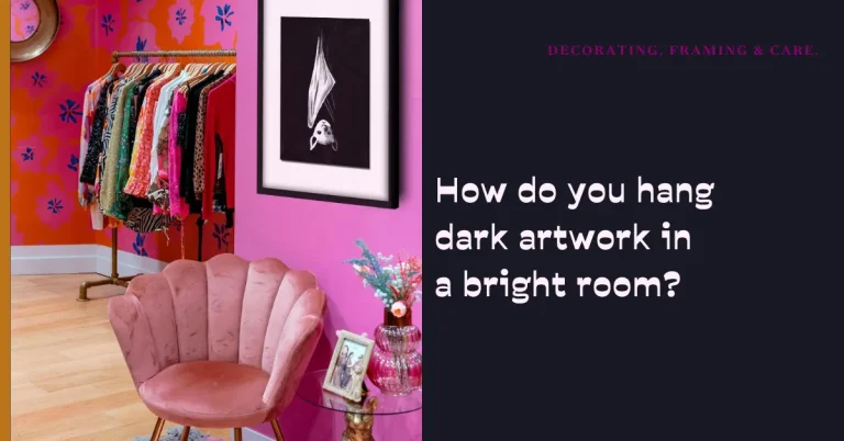
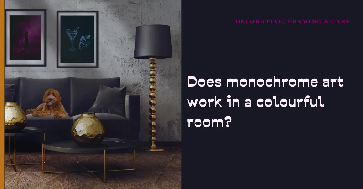

Absolutely, and not just black and white. In my work, monochrome means using a single, deep base colour (plum, teal, charcoal, or ochre) as the background, with pure white light allowing the subject to surface. Because the base is always dark enough to create high contrast, monochrome art acts as a grounding, sophisticated anchor that ties even the most colourful, eclectic rooms together without competing with them.
What “monochrome” actually means in the studio
People often think monochrome means “only grey tones.” But the word simply means “one colour.”
In the painting process, I work monochrome in a very specific way. I start with a deep gesso base in a single, rich tone. That base is always dark enough to create a strong visual void. Sometimes it is charcoal black. But sometimes it is a deep, moody plum. Sometimes it is a rich ochre. And sometimes it is a dark, watery teal.
Once that single tone is down, I let the subject surface from it using only pure white acrylic. The result is a piece that is distinctly monochromatic, but not flat. The deep base gives the painting warmth, mystery, and a specific emotional flavour. The white highlights give it sharpness and drama.
Why monochrome can be the ultimate room-tamer
Here is the beautiful reality of monochrome art. Because it relies on a single base colour, it does not fight with the colours already in your room.
A colourful room is like a beautiful orchestra. You have brass (the mustard couch). You have strings (the teal rug). You have percussion (the bright blue throw pillows).
If you hang a rainbow-coloured painting in that room, you are adding another instrument to the orchestra. Sometimes it works beautifully. But often, it just makes the room sound cluttered.
A monochrome painting, however, is the conductor. It doesn’t play its own melody. It simply stands there, quiet and commanding, holding the entire room together.
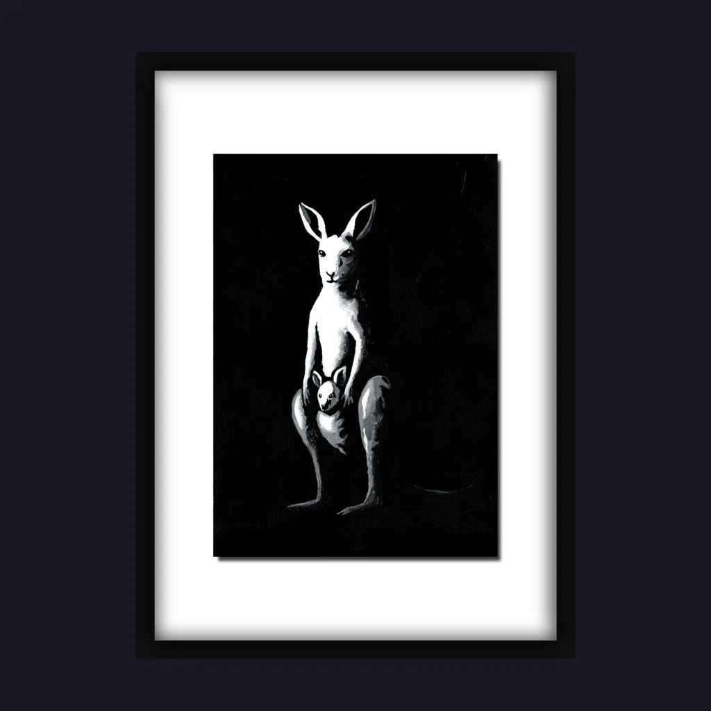
The deep plum background in a painting will gently echo a dark wood floor, without screaming for attention. The white highlights will catch the light and draw the eye, without competing with your bright pillows. It is a quiet, powerful presence that makes the colourful room feel intentional rather than chaotic.
The designer’s secret
Interior designers use monochrome art for a very specific reason: it makes colour choices feel intentional.
If you have a bright, patterned rug, a monochrome painting above the couch tells the room: “The rug is the star. I am just here to frame it.”
If you have a room with warm tones (mustard, terracotta, rust), a deep plum monochrome painting will sit beautifully alongside them, adding cool sophistication without overpowering the warmth.
And if you have a room with cool tones (blues, greys, greens), a deep teal monochrome piece will feel like it was custom-made for the space.
The role of the deep base
In my studio, I choose the base colour of each monochrome painting with intention.
Sometimes I choose charcoal, because I want the piece to feel stark and dramatic. Sometimes I choose ochre, because I want the piece to feel warm and vintage. Sometimes I choose plum or teal, because I want the piece to feel moody and atmospheric.
But the rule is always the same. The base must be dark enough to make the white contrast sing.
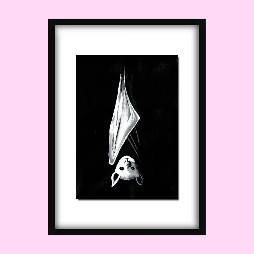
If the base is too pale, the white acrylic disappears into it. If the base is dark enough, the white acrylic steps forward and demands to be seen. It is the contrast that creates the drama.
How to hang monochrome art in a colourful space
If you are adding a monochrome piece to a colourful room, here is a simple approach to make it feel effortless.
Let it breathe. Monochrome art is powerful in its simplicity. Don’t crowd it with other artwork. Give it a generous section of the wall.
Choose a frame that fits the room. A dark frame will make the painting feel moody and grounded. A white or natural wood frame will make the painting feel modern and bright.
Don’t worry about “matching.” Your monochrome painting does not need to match your couch, your rug, or your throw pillows. It only needs to contrast enough to catch the eye, and the deep base colour will do that naturally.
A note on my upcoming collections
While the Nightlife collection is fabulously black-and-white, I am always working on new pieces that explore deeper monochrome tones as alternatives to the black: plum, teal, and ochre backgrounds with stark white subjects.
These pieces will sit beautifully in colourful, eclectic spaces, but they will also hold their own in minimalist, neutral rooms. Because monochrome art, when the contrast is right, is the ultimate chameleon. It adapts to the room, while never losing its voice.
Experience the depth of monochrome for yourself
If you would like to see how a deep, dark base can make a white subject sing, I invite you to browse the original acrylic works currently available in the shop.
Explore original artworks here. Shop Originals Page